Academic Mark

This Is Our Academic Mark
The academic mark is the University of Notre Dame’s signature logo. It represents the strong academic and Catholic traditions that are central to our University mission.
The academic mark must be present on all academic and administrative University communications. It should be used as an endorsing element, rather than as a primary graphic element.
Role
The academic mark should be present on all academic communications.
Symbolism
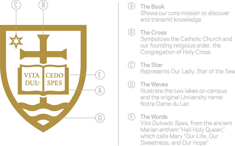
The shield is the symbolic heart of both the visual identity and the seal because it contains a set of images that represent key elements of Notre Dame’s values, traditions, and aspirations.

Color Guidelines
Notre Dame’s primary colors are blue and gold.
Strategic use of color creates powerful visual impact and is an immediate signal of quality. The academic mark comes in two color variations: one-color and two-color. Use the two-color version, when applicable, for all University communications.
In specific instances (e.g., stationery, business cards), the shield may be printed as a gold foil, but it must remain in the same arrangement.
Reproduction of the mark by screen process, enameling, etching, blind-embossing, foil stamping, etc., requires specialized treatment. Contact Notre Dame Creative at 574-631-4636 for print production advice.
Two-Color
Only use the two-color mark on a white or blue background. If any other background color is used, apply the one-color academic mark to it.

One-Color
Using a one-color mark does not mean that the entire communication needs to be printed in one color. On the contrary, the simplification of the academic mark to one color allows the rest of the content to be the focal point. The one-color mark can also be used to create a specific aesthetic or tone within the communication.


Reverse
The reverse mark may be placed on low-contrast areas of photographs. Avoid situations where the mark may lose visibility. Also be sure to place the mark away from other elements in the photograph.

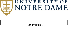
Size Restrictions

Clear Space
Clear space is the minimum “breathing room” that must be maintained around the mark. When using the mark in layout, placement text, photos, and other graphic elements must respect the clear space standard shown below. This also refers to the minimum distance from the edge of the page.
This includes placement in email and web applications.
These principles also apply to the college, school, and departmental lockups described in a separate section on this website.

Preferred Distance
Layout
The primary mark should appear prominently on all University communications in a size appropriate to the overall piece. A good rule of thumb is to begin design by placement of the mark first.
Margins and Spacing
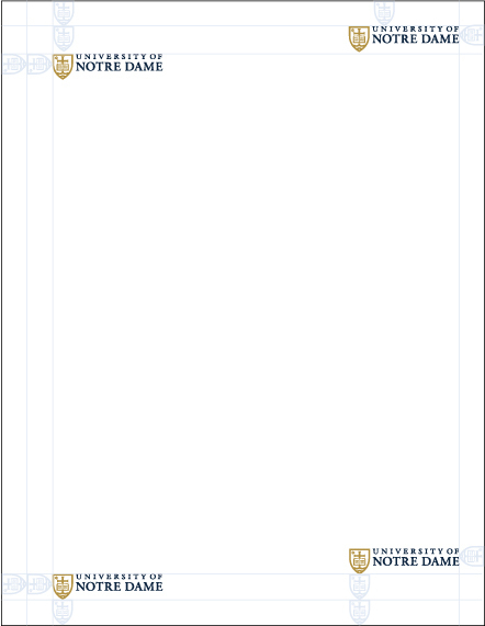
Use the shield to create spacing increments. The mark should be placed near the corners using these margins.
Size
Because the mark is used as a signature, it should not be used any wider than 25 percent of the communication width.

Consistency
-
 Do not: Rearrange or stack the academic mark
 -
 Do not: Separate the shield and the word mark
 -
 Do not: Change the size and relationship of the elements
 -
 Do not: Substitute the University name with the name of a department or unit
 -
 Do not: Alter the colors or use an outline of the academic mark
 -
 Do not: Apply effects, including drop shadows or glows
 -
 Do not: Place the academic mark over areas in a photo that may obscure it
 -
 Do not: Place the academic mark over a pattern
 -
 Do not: Use this formerly acceptable version of the academic mark