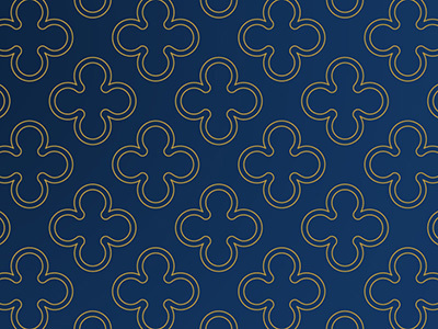
Graphic Elements
Process Texture

The textures span all courses of study and represent the thinking and hard work that drives our academic reputation. Using the process textures allows us to add interest and a storytelling element to our communications.
When to Use the Textures
- To add visual interest to a page or story
- To use for continuity with the brand expressions recommendations
How to Use the Textures
- As a background
- As a hint of color
- Behind, not in front
To ensure consistency, please use the textures as they are supplied.
Example:
Progress Lines
Notre Dame is making leaps and strides in many areas of research, from autism to genetics and energy to history. Our progress lines are a way for us to show that we are always forging ahead. They can also be used to highlight important information.
When to Use Progress Lines
- To add visual interest to a page or story
- To incorporate the monogram
- To focus on key information or language
How to Use Progress Lines
- Color (gold, blue, or reversed)
- Encasing the monogram
- Highlighting text
Example:
Traditional Line Work
Our history is one of our strongest assets. The use of traditional line work is a nod to that history. In some instances, we use this linework in a reserved way, but there is also opportunity to use these elements in unexpected and bold ways. They can add emphasis to key phrases and titles.
Download Traditional Line Work
When to Use Traditional Lines
- To arrange content
- To separate content
- To frame content
How to Use Traditional Lines
- Color (gold, blue, or reversed)
- Varying weights
Line Types
Thin lines should be solid. Medium-weight and thick lines should be “hash” style.
Use
The traditional line work should be used to contain and separate information.