Colors
Color is a fundamental component in establishing and communicating the University of Notre Dame athletics brand identity. Consistent use of color, in conjunction with the monogram, across various communications establishes brand recognition.
With colors rooted in the tradition of Notre Dame, it is important that they are always displayed with utmost accuracy. All printed colors, albeit printed on coated or uncoated stock, should match color to current Pantone chips that are up to date. The Pantone Matching System (PMS) is the authority for selecting, specifying, and matching controlled ink colors.
It is not recommended to use independent combinations of white/blue, white/gold, or white/green. These color combinations are more closely identified to other institutions and will take away from the brand equity Notre Dame has built with the consistent use of blue and gold as its primary palette.
The primary color palette should not be used in conjunction with any other colors outside of special use case scenarios that require special approval from Fighting Irish Media and Notre Dame licensing.
The following color applications are for athletics only. You may be looking for the University Branding Color Palette.
Color Values
-
Notre Dame Blue
Pantone 289
c100 m76 y12 k70
r12 g35 b64
#0c2340 -
Standard Dome Gold
Pantone 117
c6 m27 y100 k12
r201 g151 b0
#c99700 -
Irish Green
Pantone 348
c96 m02 y100 k12
r10 g132 b61
#00843d
Color Values: Digital Applications
These colors should only be used for on-screen digital applications such as video boards. To ensure the Notre Dame athletics palette remains consistent, please use the following prescribed ranges:
Notre Dame Blue
Dome Gold
Irish Green
Notes:
- Do not use any digital tools (e.g., eyedropper) to select colors that appear within the gradient.
- The gradient ranges are intended for digital use and should not be recreated or altered.
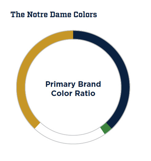
Primary Brand Color Ratio
The official colors of Notre Dame athletics are blue and gold and should be used in all cases when communicating on behalf of the brand. White is a supporting color in conjunction with blue and gold. In the primary color palette, green is an accent color to be used sparingly. This graphic shows a suggested balance of the colors for brand communication.
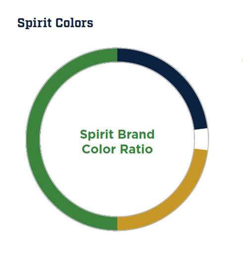
Spirit Brand Color Ratio
The spirit color palette includes Irish green, representing Notre Dame’s Irish heritage and fighting spirit. The spirit color palette should not be used in conjunction with any other colors outside of special use case scenarios that require special approval from Fighting Irish Media and Notre Dame licensing. Contact Fighting Irish Media with questions.
Exceptions
Occasional opportunities arise to use an expanded color palette that ventures outside of the primary color palette. Typical opportunities include the occasional use of unique uniforms, such as those promoting breast cancer awareness (pink). Though acceptable for special occasions, using colors outside of the primary palette is not intended for long-term initiatives.
The rules of certain sports require colors outside of the primary color palette. For example, soccer goalies generally wear special-colored jerseys that differentiate their position from other players on the field. In this case and similar instances, it is permissible to use colors outside of the primary color palette. However, it is not permissible to use colors outside of the palette for purely aesthetic reasons. Seek approval from Fighting Irish Media and Notre Dame licensing for permissible applications and color recommendations.
Rules
When applying the Notre Dame athletics brand with permissible color exceptions, please adhere to the following guidelines:
- Keep the executions simple and do not use colors that will clash with each other.
- The Notre Dame monogram must be included in all applications with extended palettes.
- When applicable, it is preferred to use the one-color blue monogram in conjunction with extended palettes. If the one-color blue monogram doesn’t work because of contrast, please use the one-color white monogram. Use of the monogram outside of the core palette must be approved by Fighting Irish Media.
- Never use an extended palette on the basis of personal, aesthetic preferences.
- Always obtain approval from Fighting Irish Media and Notre Dame licensing when using colors outside of the primary color palette.
NOTE:
The assets featured in this section are to be used solely by the University of Notre Dame Athletics Department. They are not intended to be used in academic or administrative communications.
In the rare instance that an Athletics asset could be considered for use by an academic or administrative entity, that entity must first request use of the branding element(s) by contacting Fighting Irish Media.

